


AktivGrid Design System
Building a scalable component library from zero as the sole designer
Overview
When you're the only designer at a growing startup, you quickly realize that design inconsistency becomes technical debt. Buttons looked different across pages. Forms had varying validation patterns. Colors and spacing were decided on the fly. Every new feature meant reinventing the wheel.
So I built a design system. Not because it was trendy, but because it was necessary. The AktivGrid Design System became the single source of truth for how our product looked, felt, and behaved, spanning four years of continuous development and iteration.
Starting From Zero
As the sole designer at a growing EdTech startup, I faced a common challenge: maintaining design consistency across an expanding product. Our platform was growing rapidly, adding new features weekly, but each feature introduced new inconsistencies. The same button might have three different styles across different pages. Form validation messages followed no consistent pattern. Typography and spacing were decided ad-hoc during implementation.
This wasn't just an aesthetic problem; it was slowing us down. Engineers were constantly asking design questions. New features required designing every component from scratch. Onboarding new team members was difficult because there was no reference for "how we do things."
The solution was clear: we needed a design system. But not a superficial style guide; a comprehensive system that would serve as the foundation for all future design and development work.
The System Architecture
I structured the AktivGrid Design System in three distinct layers, each building on the previous:
Foundation Layer: Design Tokens
At the base were design tokens, the atomic decisions that define our visual language. These weren't just design decisions; they were coded as CSS custom properties and JavaScript constants that both designers and developers could reference.
- Color system: A carefully crafted palette with semantic naming (primary, secondary, success, warning, danger) and a complete set of shades for each color family
- Typography scale: Type sizes, weights, line heights, and letter spacing that created clear visual hierarchy
- Spacing scale: An 8-point grid system that ensured consistent rhythm across all layouts
- Elevation system: Shadow definitions that established depth and layering
- Motion guidelines: Timing functions and duration values for animations and transitions
Component Layer
The heart of the system was over 100 reusable UI components, each meticulously designed and documented. These ranged from basic atoms like buttons and inputs to complex molecules and organisms:
- Form controls: Text inputs, dropdowns, checkboxes, radio buttons, sliders, date pickers, all with consistent validation and error states
- Navigation: Headers, sidebars, breadcrumbs, tabs, pagination, and menu systems
- Data display: Tables with sorting and filtering, cards, lists, and specialized visualizations
- Feedback: Alerts, toasts, modals, tooltips, and loading states
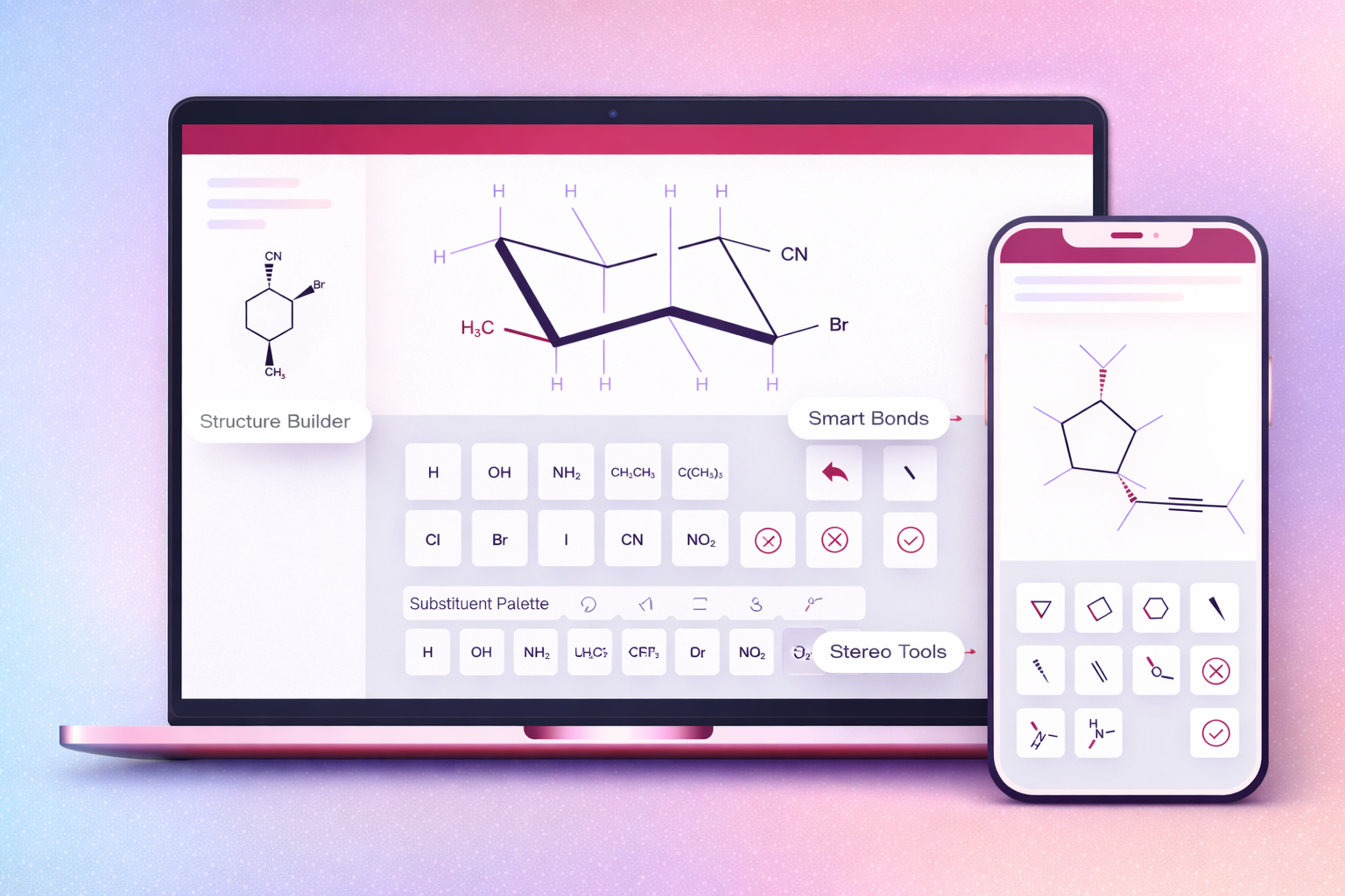
- Specialized components: Mathematical expression editors, code syntax highlighting, interactive diagrams, and AI-powered suggestion interfaces
Pattern Layer
The top layer captured higher-level compositions showing how components work together in real contexts:
- Page templates for common layouts (dashboard, content pages, settings)
- Form patterns for different data collection scenarios
- Modal workflows for multi-step processes
- Empty state designs that guide users toward action
- Error handling patterns that help users recover gracefully
Three-layer system: Tokens, Components, and Patterns
Collaboration with Engineering
A design system only works if engineers actually use it. I learned early that simply handing off Figma files wasn't enough. The system needed to live in code, and I needed to be involved in that implementation.
I worked directly with the engineering team to implement components in React. I didn't write all the code myself, but I pair-programmed on complex components, reviewed pull requests for design consistency, and maintained the component library alongside the developers. This hands-on approach ensured that the implemented components matched the design specifications and that I understood the technical constraints we were working within.
I created comprehensive documentation that spoke to developers' needs:
- Interactive Storybook demos: Engineers could see every component variant, interact with it, and inspect the code
- React prop documentation: Clear API documentation for every component with TypeScript definitions
- Usage examples: Code snippets showing common implementations and patterns
- Integration guides: How to use the design system with our existing codebase and tooling
The investment paid off dramatically. Before the design system, a typical feature took 3-4 weeks from design to implementation. After establishing the system, we cut that time by 40%. Engineers could prototype new features using existing components, and I could focus on solving new problems instead of redrawing buttons for the hundredth time.
Interactive component documentation with code examples
Documentation as Design
I treated documentation as a design artifact itself, not an afterthought. Good documentation doesn't just describe what a component is; it explains when to use it, how it should behave, and why it exists.
Every component in the AktivGrid Design System included:
- Usage guidelines: When to use this component versus alternatives, with real examples from our product
- Accessibility notes: Keyboard navigation requirements, screen reader behavior, ARIA attributes, and color contrast considerations
- States and variants: Visual examples of all possible states (default, hover, active, focus, disabled, loading, error)
- Code examples: React snippets showing common implementations and edge cases
- Do's and Don'ts: Visual examples of correct and incorrect usage with explanations
- Design rationale: Why the component works the way it does and what problems it solves
The documentation wasn't just for onboarding; it became a reference that the entire team used daily. If I couldn't explain when and how to use a component clearly, it was a sign that the component itself probably needed to be redesigned.
Accessibility First
Accessibility wasn't a feature we added later; it was built into the foundation of the design system. Every component was designed and tested to meet WCAG 2.1 AA standards at minimum.
This meant:
- Keyboard navigation: Every interactive element was fully accessible via keyboard, with visible focus indicators and logical tab order
- Screen reader support: Proper semantic HTML, ARIA labels, and announcements for dynamic content
- Color contrast: All text and interactive elements met minimum contrast ratios, with automated testing in our build pipeline
- Motion sensitivity: Animations respected prefers-reduced-motion settings
- Responsive design: All components worked across device sizes and supported text resizing up to 200%
By baking accessibility into the design system, we made it easy for engineers to build accessible interfaces by default, rather than retrofitting accessibility later.
Living System
The best design systems aren't static; they evolve with the product. Over four years, I maintained and grew the AktivGrid Design System while ensuring it remained coherent and usable.
I established a governance process that balanced consistency with flexibility:
- Contribution guidelines: Anyone could propose changes or new components through a standardized request process
- Design reviews: New components needed to solve problems that existing components couldn't and fit within the system's principles
- Version control: Clear versioning and migration guides when breaking changes were necessary
- Regular audits: Quarterly reviews to identify unused components, consolidate duplicates, and update documentation
This governance kept the system lean while allowing it to grow thoughtfully. We started with 30 basic components in 2020 and grew to over 100 by 2024, including specialized components for mathematical notation, data visualization, and AI-powered interactions.
More importantly, the design system became part of how we worked. New engineers were onboarded with the design system as their first introduction to the product. Product decisions referenced its patterns. Design reviews used its language. It wasn't just a tool; it was how we communicated about design.
Specialized Components for EdTech
Building a design system for an educational technology platform required components that went beyond typical UI kits. I designed specialized components that addressed the unique needs of mathematics education:
- Math expression editor: An input component that allowed students to type mathematical notation naturally, with live preview and error validation
- Interactive graph builder: A drag-and-drop interface for creating and manipulating mathematical graphs
- Step-by-step solution display: Components that progressively revealed solution steps with annotations and explanations
- Formula rendering: Consistent LaTeX rendering with fallbacks and accessibility support
- Hint systems: Contextual help components that provided scaffolding without giving away answers
These specialized components became competitive advantages. They weren't available in off-the-shelf component libraries, and they directly addressed the needs of our users (students and educators).
Custom components for mathematical notation and interactive learning
Impact and Results
The AktivGrid Design System transformed how we built products. The impact was measurable across multiple dimensions:
Development Efficiency
Development time for new features decreased by 40%. Engineers could assemble interfaces from existing components rather than building from scratch. Design-to-development handoff became smoother because we were working from a shared vocabulary.
Design Consistency
Visual inconsistencies across the product decreased dramatically. Users experienced a coherent interface regardless of which feature they were using. This consistency built trust and reduced cognitive load.
Onboarding
New engineers could contribute meaningful code within their first week. The design system provided clear patterns to follow, reducing the learning curve and preventing common mistakes.
Collaboration
Cross-functional collaboration improved. Product managers could reference components in specifications. Engineers could propose designs using system components. Everyone spoke the same language.
Scalability
As the product grew, the design system scaled with it. New features were faster to design and build because they leveraged existing components. The system became the foundation for sustainable growth.
Lessons Learned
Building and maintaining a design system for four years taught me valuable lessons:
- Start small: I began with the most commonly used components and expanded based on actual needs, not hypothetical ones
- Designer-developer collaboration is essential: The system only succeeded because I worked directly with engineers on implementation
- Documentation is as important as design: A poorly documented component won't be used correctly, no matter how well designed
- Governance prevents chaos: Without clear processes for proposing changes, design systems become bloated and inconsistent
- Systems must evolve: A design system that doesn't change becomes a constraint rather than an enabler
- Accessibility can't be an afterthought: Building it into the foundation makes it easy; retrofitting it is expensive