


Overview
Nursing professionals are required to complete continuing education credits to maintain their licenses, but most e-learning platforms treat these requirements as a checkbox exercise. NursingCE.com wanted to be different. They wanted to create an engaging learning experience that nurses would actually value.
The challenge was clear: the existing platform had low completion rates, frustrated users, and a certification tracking system that confused more than it helped. I was brought in to redesign the course navigation and certification tracking systems, making them intuitive, accessible, and genuinely useful for busy healthcare professionals.
Understanding the Problem
I started with user research: interviewing nurses, observing how they used the platform, and analyzing support tickets. The problems became immediately clear:
- Lost in navigation: Users couldn't easily find courses relevant to their specialty or state requirements
- Unclear progress: There was no way to see at a glance how many credits were needed versus completed
- Certification chaos: The certification tracking system required manual entry and provided no reminders about expiring licenses
- Mobile unfriendly: Many nurses accessed courses during breaks at work on mobile devices, but the experience was frustrating
- Poor resume functionality: If a nurse got interrupted mid-course (common in healthcare), finding where they left off was unnecessarily difficult
The root issue wasn't that nurses didn't want to complete their continuing education; it was that the platform made it harder than it needed to be.
Redesigning Course Navigation
The existing course catalog was a long, unsorted list. Finding relevant courses meant scrolling through hundreds of options or using a search that rarely returned useful results. I redesigned the navigation to prioritize what nurses actually care about:
Smart Filtering and Recommendations
Instead of starting with a generic catalog, the new design began with personalization. During onboarding, nurses entered their specialty (pediatrics, emergency, critical care, etc.), their state licensing requirements, and any certifications they held. The platform then:
- Prioritized relevant courses: A nurse in California doing pediatric care saw pediatric-focused courses that met California requirements first
- Highlighted urgent needs: If a certification was expiring within 60 days, those courses appeared at the top with clear deadline indicators
- Suggested learning paths: Rather than isolated courses, the platform suggested curated learning paths like "Emergency Response Fundamentals" or "Pediatric Pain Management"
Clear Information Architecture
I restructured the navigation to match how nurses think about their education:
- By specialty: Browse courses organized by nursing specialty with specialty-specific filters
- By requirement type: Filter specifically for state-mandated courses, certification renewals, or general continuing education
- By time commitment: Busy nurses could filter by course length (30 minutes, 1 hour, 2+ hours) to fit learning into their schedules
- By credit value: See at a glance how many CE credits each course was worth
Visual Progress Indicators
Every course card showed clear progress indicators. If a nurse started a course but didn't finish, it appeared in a "Continue Learning" section with a progress bar showing exactly where they left off. Completed courses were automatically moved to a transcript section with downloadable certificates.
Smart filtering and personalized course recommendations
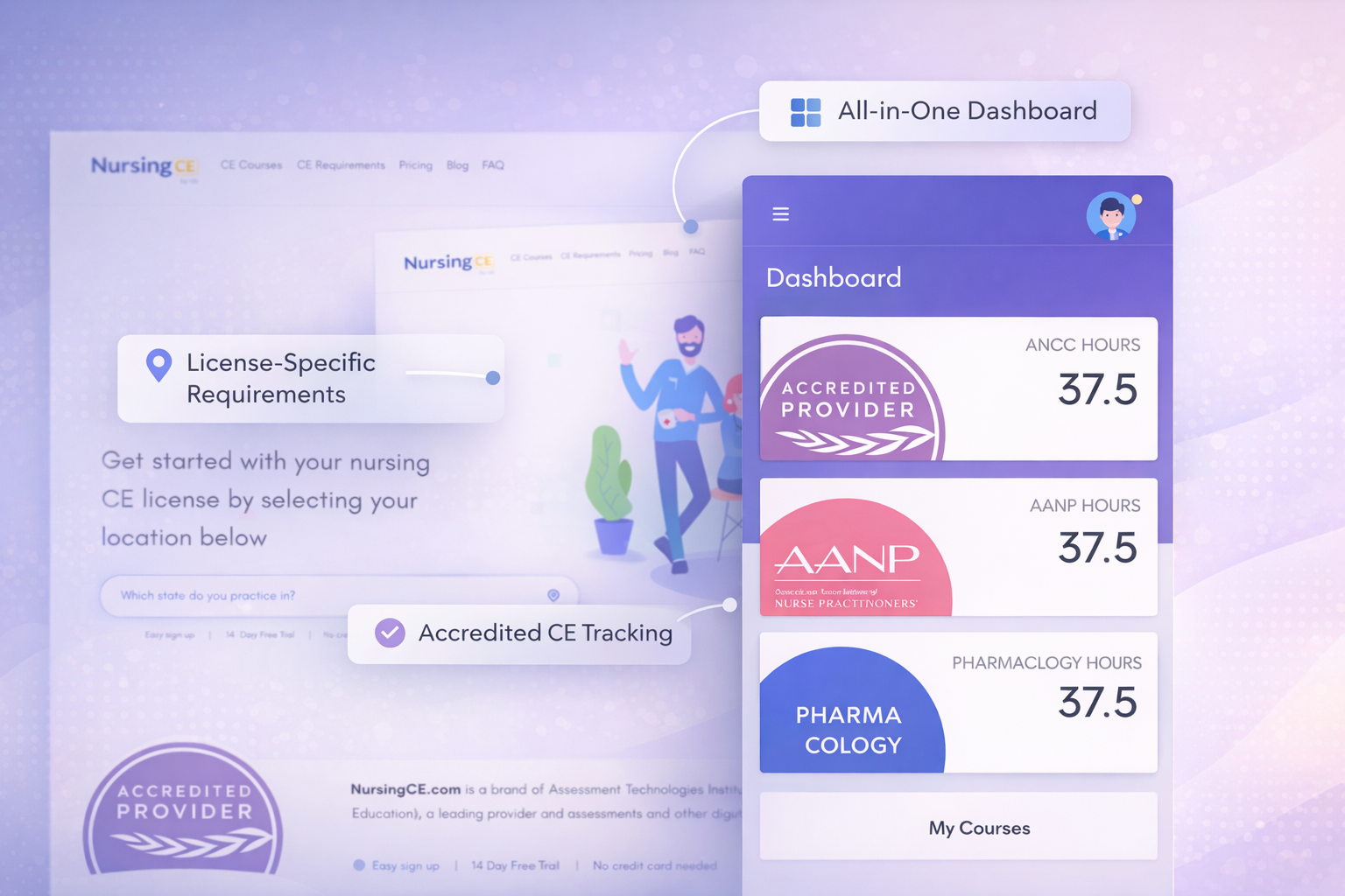
Certification Tracking System
The certification tracking system was the most broken part of the platform. Nurses had to manually enter their certification numbers, expiration dates, and required credits. There was no integration with the course system, so they couldn't see if completed courses actually counted toward their requirements.
I designed a comprehensive tracking dashboard that became the central hub of the platform:
Visual Dashboard
The new dashboard presented complex certification requirements in a scannable, visual format:
- License status cards: Each nursing license (RN, LPN, APRN, etc.) had its own card showing renewal date, credits required, credits earned, and time remaining
- Color-coded urgency: Cards used color to indicate status: green for current, yellow for expiring within 90 days, red for overdue or critical
- Stacked certifications: Additional certifications (BLS, ACLS, PALS, etc.) were displayed with their own cards, each tracking specific renewal requirements
- State-specific requirements: The system automatically pulled state nursing board requirements and displayed them clearly, so nurses knew exactly what their state needed
Automated Credit Tracking
The game-changer was integration between courses and certifications. When a nurse completed a course, the system automatically:
- Applied the credits to relevant certifications based on course accreditation
- Updated progress bars on license cards
- Generated certificates and added them to the transcript
- Recalculated remaining credit needs and updated recommendations
This eliminated manual tracking and gave nurses confidence that their education was counting toward their requirements.
Proactive Reminders
The system sent intelligent reminders via email and push notifications:
- 90 days before expiration: "Your RN license expires in 3 months. You need 12 more CE credits."
- 60 days before: "Action needed: Complete 12 CE credits in the next 2 months" with direct links to recommended courses
- 30 days before: Urgent reminder with expedited course options
- Post-course: "You've earned 2 credits toward your RN renewal. 10 credits remaining."
These reminders weren't just notifications; they were actionable, containing direct links to complete the needed education.
Visual dashboard showing license status and credit progress
Mobile-First Course Experience
Research showed that 40% of nurses accessed courses on mobile devices, often during short breaks at work. But the mobile experience was barely functional. Videos didn't play reliably, navigation was clunky, and quizzes were difficult to complete on small screens.
I redesigned the course experience mobile-first:
- Responsive video player: Optimized for small screens with easy fullscreen toggle, adjustable playback speed, and reliable streaming
- Chunked content: Courses were broken into short modules that could be completed in 10-15 minutes, perfect for a break
- Mobile-optimized quizzes: Large tap targets, clear feedback, and the ability to save progress and return later
- Offline access: Download courses to watch offline during commutes or in areas with poor connectivity
- Quick resume: Opening the app automatically brought up the last course you were watching, right where you left off
Mobile-first design optimized for learning on the go
Accessibility for Healthcare Professionals
Healthcare is diverse, and the platform needed to serve nurses of all ages, abilities, and technical comfort levels. I built accessibility into every design decision:
- Screen reader support: Full ARIA labeling and semantic HTML so visually impaired nurses could navigate independently
- Keyboard navigation: Every interactive element was fully accessible via keyboard
- Closed captions: All video content included accurate captions, helping nurses in noisy environments and those with hearing impairments
- High contrast mode: Optional high contrast theme for low-vision users
- Text resizing: All text and UI elements scaled properly when users increased font size
- Simple language: Avoided jargon in UI text and provided clear instructions throughout
Accessibility wasn't a separate consideration; it was fundamental to making the platform usable for all nurses.
Design Process and User Testing
This wasn't a project where I designed in isolation and handed off specs. I worked closely with nurses throughout the process:
- Initial interviews: Spoke with 15 nurses across different specialties to understand pain points
- Wireframe testing: Tested early concepts with nurses to validate the information architecture
- Prototype testing: Created interactive Figma prototypes and ran usability tests with 8 nurses
- Beta testing: Launched a beta version to 100 nurses and collected feedback through surveys and usage analytics
- Iterative refinement: Made adjustments based on real-world usage patterns
One key insight from testing: nurses valued efficiency over polish. They wanted the platform to work quickly and reliably, not to be flashy. This guided design decisions toward clarity and speed over decorative elements.
Impact and Results
The redesign launched in mid-2022 and the results validated the user-centered approach:
User Satisfaction
User satisfaction scores increased by 60%, measured through post-course surveys and NPS scores. Nurses specifically praised the certification tracking dashboard and the improved course discovery.
Completion Rates
Course completion rates increased by 30%. The combination of better navigation, mobile optimization, and resume functionality meant nurses were finishing courses they started.
Platform Growth
The platform grew to over 5,000 active nurses within six months of launch. Word-of-mouth recommendations became a primary driver of growth, with nurses telling colleagues about the improved experience.
Support Ticket Reduction
Support tickets related to certification tracking dropped by 75%. The new system's clarity meant nurses could manage their requirements independently without needing help.
Mobile Usage
Mobile course completions increased by 45%, showing that the mobile-first redesign successfully served nurses who learned on the go.
Lessons Learned
This project reinforced several important principles:
- Context matters: Designing for healthcare professionals required understanding their work environment: high stress, limited time, frequent interruptions
- Solve the real problem: The initial brief was to "make the platform prettier," but research revealed the real issues were navigation and tracking
- Progressive disclosure: Nurses had complex requirements, but showing everything at once was overwhelming. The dashboard revealed details progressively as needed
- Mobile isn't optional: For busy professionals, mobile access isn't a nice-to-have; it's essential
- Automation reduces friction: Automating credit tracking eliminated a major source of frustration and errors
- Test with real users: Assumptions about what nurses needed were often wrong. Testing with actual users was invaluable