


Centrify Website Redesign
I reorganized, rewrote, and redesigned Centrify’s website so potential clients can understand its services and reach the team faster.
Overview
Centrify had solid services and an experienced team. The website just made those strengths difficult to find.
On my first pass through the site, I had to move between several pages and read long blocks of copy to understand what Centrify offered. The navigation was crowded, the messaging changed from page to page, and the design did not feel consistent.
I reviewed every public page, reorganized the services, rewrote the key messages, and created a shared visual system. I also built a working test site so the team could review the full experience before moving it into Wix.
View Test WebsiteFinding the Real Problem
The original site was not short on content. It covered data integration, ConvokeDX, automation, analytics, productivity, security, and EDI. It also included leadership profiles and useful company updates. The issue was how all of that information was organized.
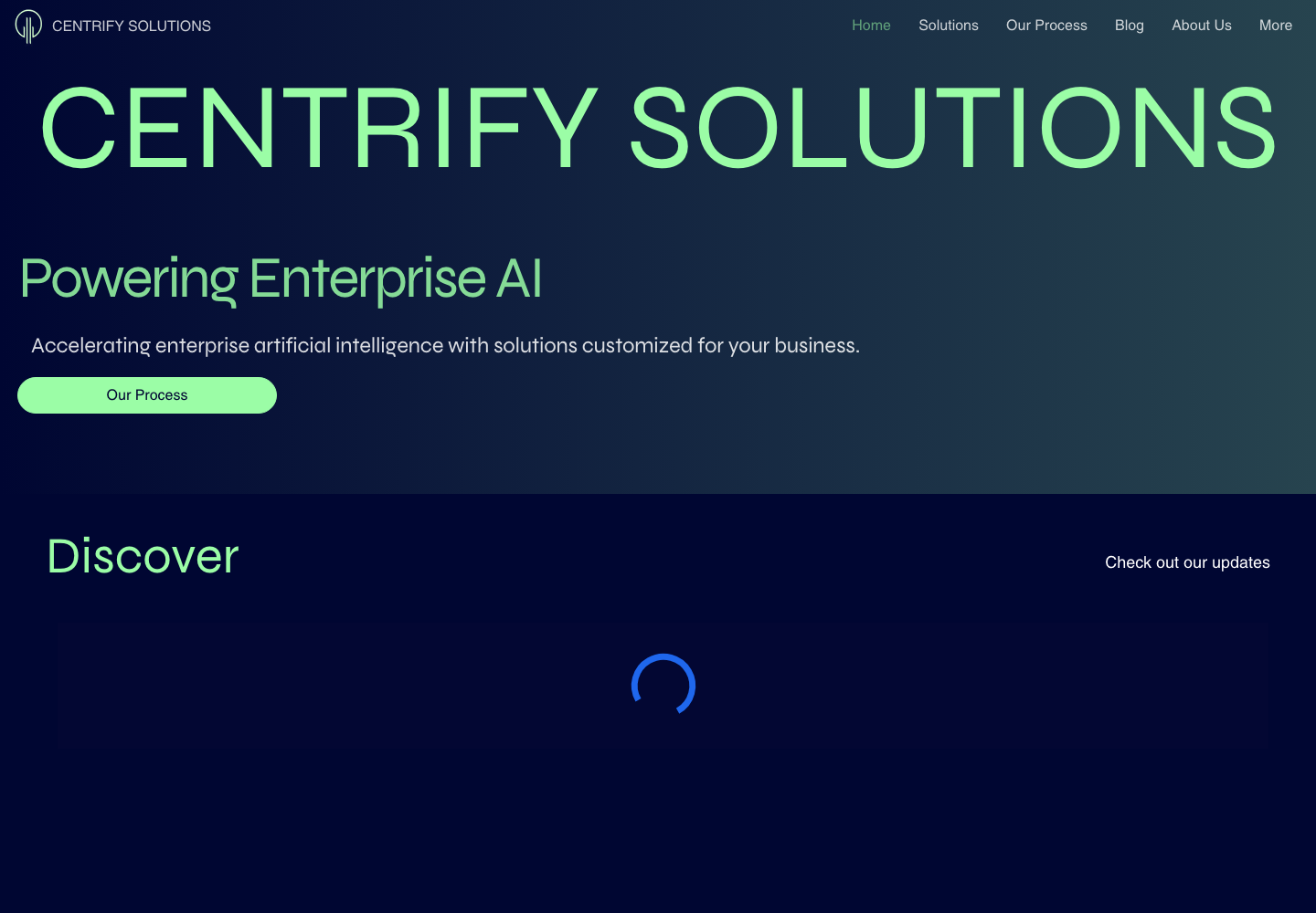
The company name filled most of the first screen, before visitors knew what Centrify could do for them. The navigation had too many choices, key benefits sat inside long paragraphs, and each page followed a different layout. Some legal pages still included unfinished Wix placeholder text, which made the site feel incomplete.
The work was there. The website needed a clearer order and a more obvious path forward.
Before and After
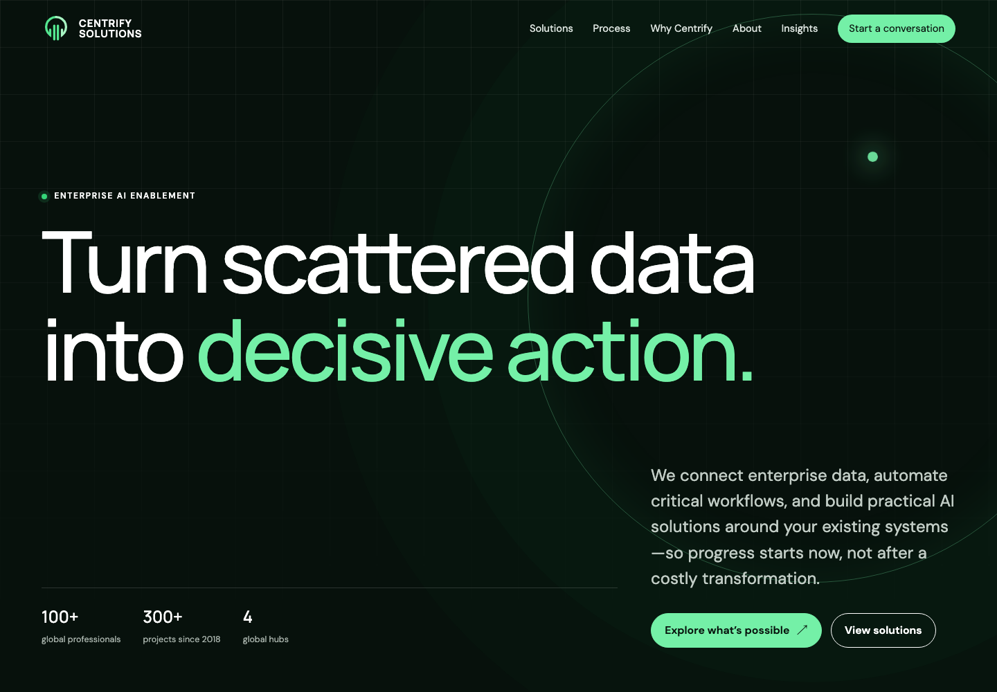
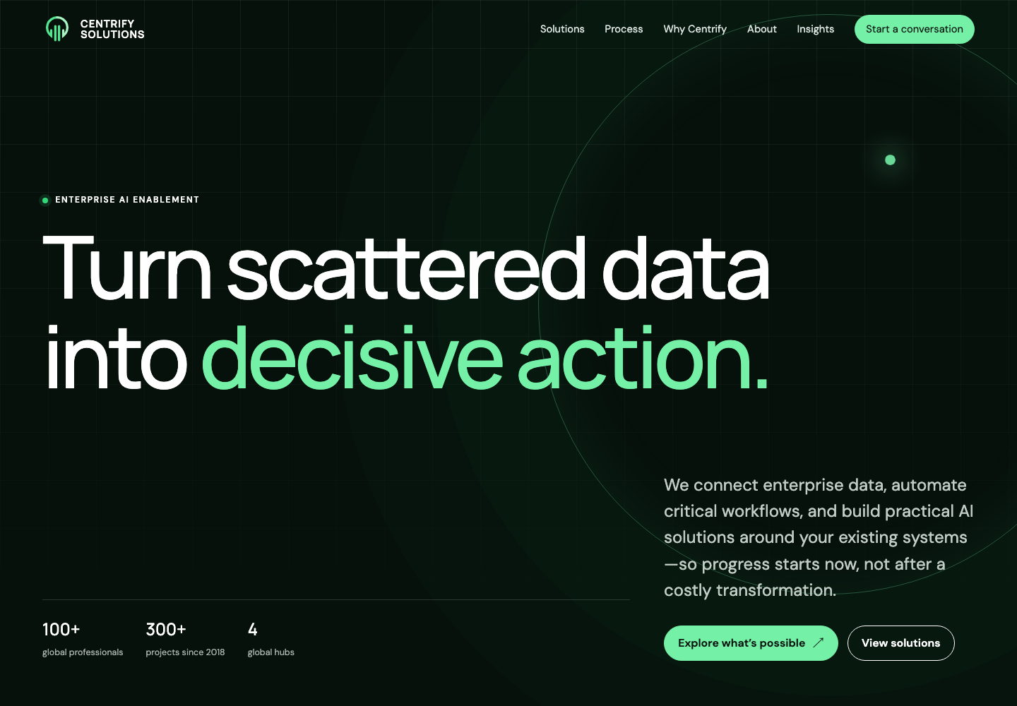
I changed what the homepage says first. Instead of opening with the company name and a broad statement about enterprise AI, it now starts with a problem clients already recognize: scattered data. “Turn scattered data into decisive action” explains both the problem and the value in one line.
 Original
Redesign
Original
Redesign
The redesigned first screen communicates the problem, value, proof, and next step at a glance.
Applying the Same Thinking Across the Site
Once the homepage direction was working, I applied the same structure and visual rules to the rest of the site.
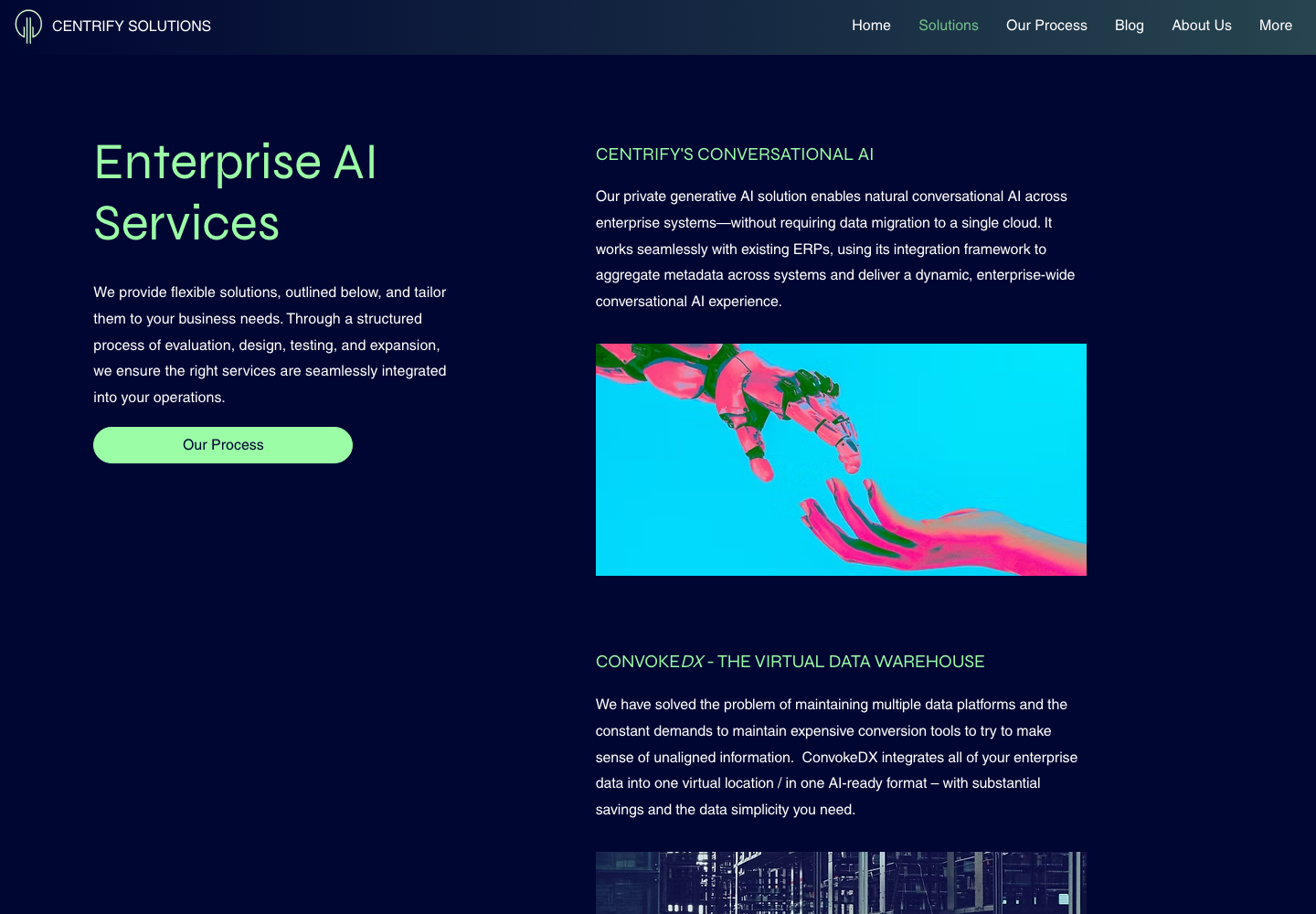
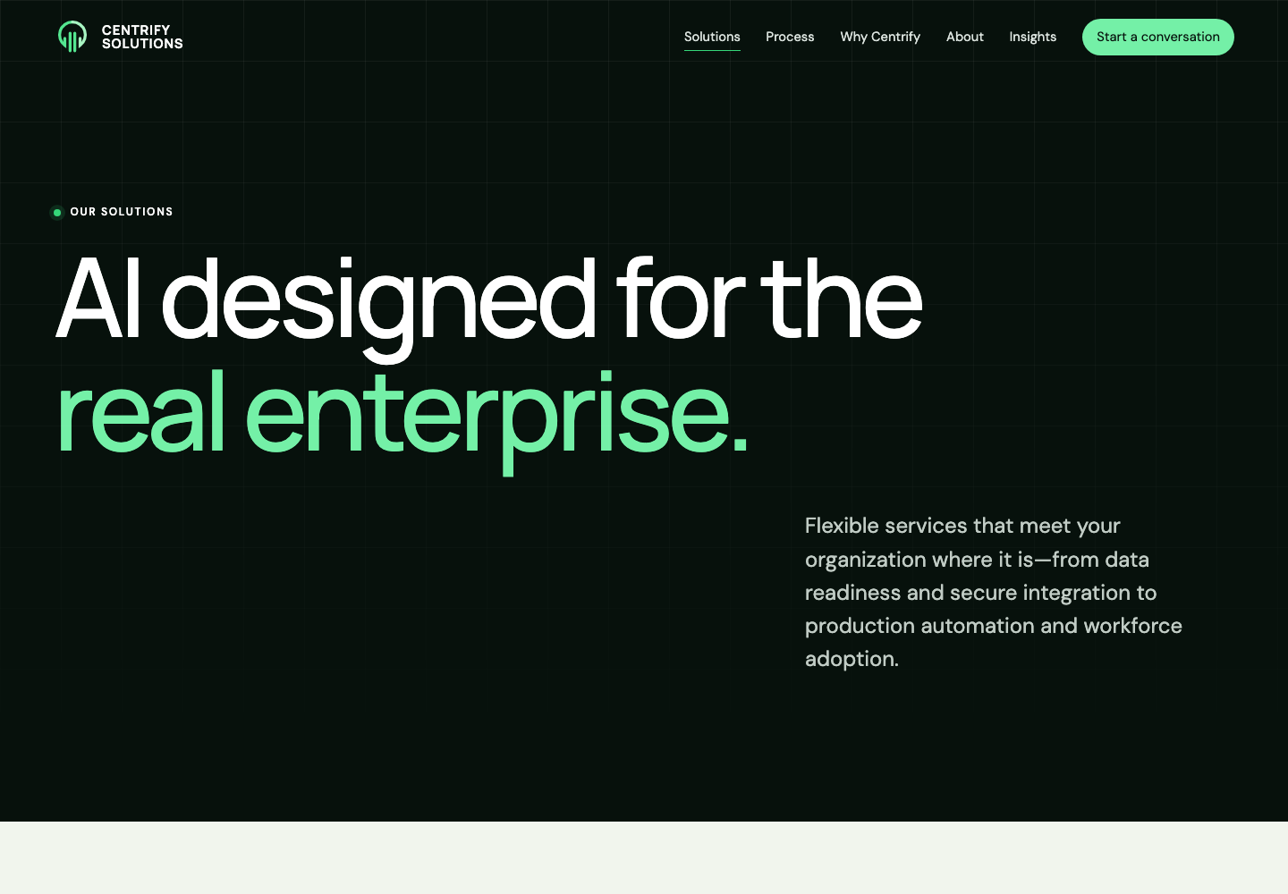
Solutions: give the services a clear structure
The original page showed several detailed service descriptions at once. I gave the page a clearer introduction, then grouped the services around the problems they help clients solve.
Process: explain how the work moves forward
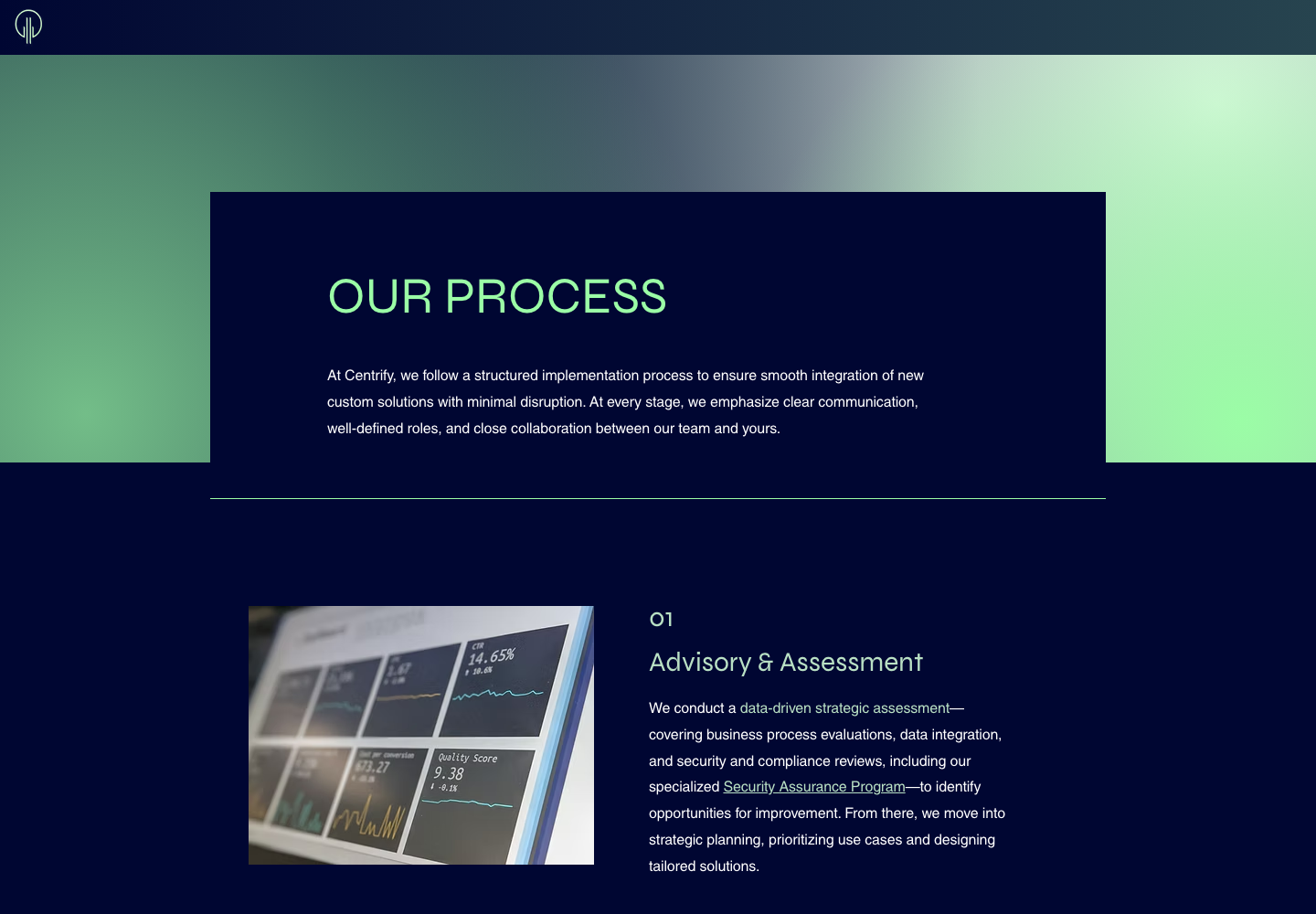
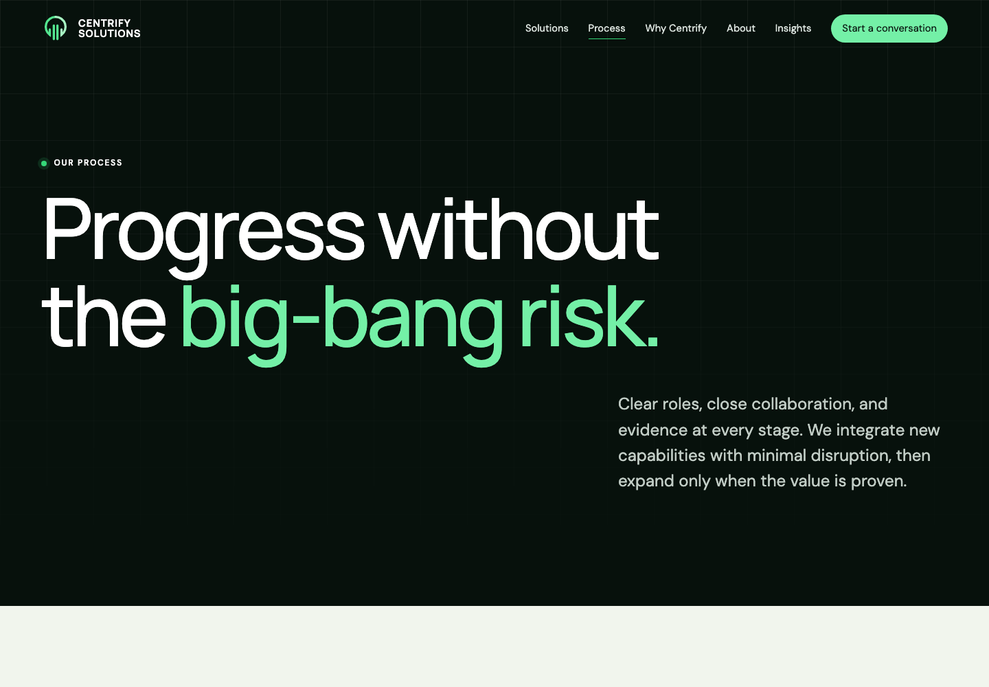
The original copy described implementation in broad terms. I rewrote it around a more practical client concern: how Centrify can introduce new capabilities without disrupting the business.
 Original
Redesign
Original
Redesign
Drag the divider to compare the opening message and visual hierarchy.
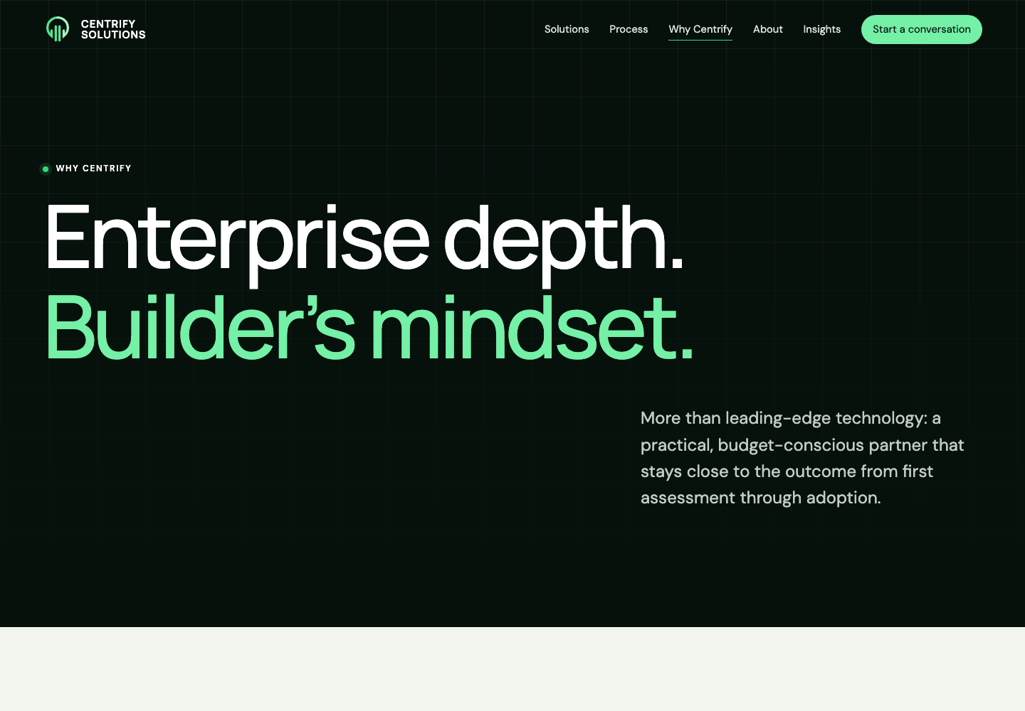
Why Centrify: answer the question right away
The original page asked why a visitor should choose Centrify but left most of the first screen empty. The new version answers immediately with the team’s enterprise experience and practical approach to delivery.

Giving Each Section One Job
I wanted the homepage to feel easy to follow. Each section answers a simple question, then leads naturally to the next one.
Start with the client’s problem
Explain the issue in familiar language before introducing enterprise AI terminology.
Show how the services connect
Present data integration as the foundation, then explain what AI, analytics, and automation can do with it.
Add proof where it helps
Use team experience, project count, locations, partnerships, and articles to support the story as visitors read.
Make the next step clear
Keep the navigation focused and give visitors separate paths to contact the team or explore the services.
One System for the Whole Site
I created shared rules for typography, spacing, cards, service rows, process steps, articles, and calls to action. Reusing those pieces keeps the site consistent and makes future Wix updates easier to manage.
Clearer writing
I rewrote the main messages around what clients need to understand, without adding claims the company could not support.
Reusable components
The same visual patterns now work across service, company, article, and legal pages.
Accessibility built in
Contrast, focus states, headings, form labels, keyboard support, and reduced motion were considered from the beginning.
Simple test build
I built the test site with shared HTML, CSS, and JavaScript so the team could review a complete working experience.
Validation
I tested the site in a real browser at widths from 390px mobile to 1440px desktop. I checked the navigation, search, forms, skip links, focus states, reduced-motion settings, and internal routes.
- 100 Lighthouse accessibility across the audited experience
- 100 Lighthouse best practices and 100 SEO
- Zero missing internal references across old and new routes
- No horizontal overflow at tested mobile and desktop widths
The test build gave the team a complete experience to review instead of a collection of static mockups.
Approved and Moving Into Wix
The Centrify team approved the redesign after reviewing the working test site. I am now rebuilding the approved experience in their existing Wix platform.
The implementation work includes adapting the components to Wix, setting up the responsive layouts, and carrying over the accessibility and content improvements from the test build.
My goal was not to make Centrify look like a different company. It was to help people see the company more clearly.