


ToddlerQuest
A free, ad-free educational game platform for curious toddlers and the parents who love them
Overview
My wife had the ideas. I had the keyboard. Together, we built something we genuinely wanted to exist: a place where toddlers could learn through play without ads, accounts, or data collection.
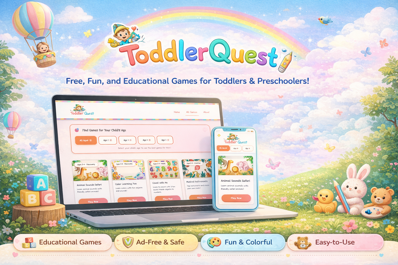
ToddlerQuest is a free web-based educational platform for children aged 2–5. It launched in 2025 as a passion project we built in our spare time. My wife conceived the game concepts and shaped the experience with an eye for what actually engages young children. I handled all design and development, translating her ideas into ten interactive games covering animals, colors, counting, the alphabet, shapes, music, and more. Since launch, we've expanded beyond games into a dedicated activities section with sixteen hands-on, offline activities including open-source downloadable coloring books, because screen time should complement learning, not replace it.
The platform is live at toddlerquest.com and built entirely with vanilla HTML, CSS, and JavaScript: no frameworks, no dependencies, and no tracking of any kind.
The Problem
Finding safe, high-quality screen time for toddlers is harder than it should be. The free options come with significant trade-offs that parents shouldn't have to make.
Ads in children's experiences
Free educational apps are ad-supported. For toddlers mid-learning, that means disruptive interruptions and exposure to content wholly inappropriate for their age.
Account requirements and data collection
Many platforms require account creation before a child plays a single game. When the product is free, the user's engagement patterns become the product.
Interfaces built for older children
Most apps assume motor control and reading ability that toddlers don't have: small touch targets, fast-moving interactions, and UI patterns that cause frustration, not learning.
Missing the parent-child moment
Existing platforms design to occupy a child alone, not to invite a parent in. The best early learning happens when a parent and child discover something together.
How We Worked Together
This project started with a simple observation from my wife: there wasn't a single free game site she felt completely comfortable putting in front of a toddler. That observation became the brief.
She shaped the ideas. I shaped the experience. The product is better for both.
My wife led the conceptual design of every game — what it teaches, how a child wins, what it should feel like to play. Her instincts shaped decisions I wouldn't have reached alone: slower pacing, bigger feedback moments, audio as a reward rather than just a signal, and letting a child feel successful early.
I took those concepts and translated them into interfaces, mechanics, and code. The collaboration gave me a constant editorial voice asking whether the experience was truly serving a young child, not just technically functional.

Watching real toddlers use the platform shaped every design decision
The Games
Each game targets a specific developmental concept appropriate for ages 2–5. They are self-contained, immersive, and designed to be playable in short sessions without needing to save progress.
Sound and Sensory
- Animal Sounds Safari: Tap animals to hear their real sounds. Simple cause-and-effect for the youngest players, with large illustrated characters and immediate audio reward.
- Musical Instruments: Tap instruments to produce sounds and create music. Encourages free exploration and rhythm without any failure state.
- Ocean Adventure: Explore sea creatures and their world. Designed to spark curiosity about nature through sound and movement.
Early Academics
- Color Learning Fun: Discover colors through real-world objects with audio reinforcement. Designed to build color vocabulary naturally.
- Count with Me: Progressive counting with three difficulty levels that grow with the child from simple recognition to active counting.
- ABC Adventure: Letter recognition through dynamic cards with character companions that make the alphabet feel like a cast of characters.
- Shape Sorter: Match and identify geometric shapes. Builds spatial reasoning and foundational geometry vocabulary.
- My Body: Explore body parts through illustrated characters and audio prompts. Builds early anatomy vocabulary and self-awareness in an age-appropriate, affirming way.
Imaginative Play
- Butterfly Garden: Help butterflies find their matching flowers. A gentle color-matching activity with a nurturing narrative wrapper.
- Birthday Party: A celebration-themed activity that combines colors, counting, and sequential thinking in a joyful context familiar to every toddler.
Redesigning the Experience
After launching, we noticed usability problems we hadn't anticipated. They weren't bugs. They were design failures that only became visible once real toddlers started using the platform.
The scroll problem
The original homepage had a large hero section before a single game was visible. For adults, standard page structure. For a two-year-old handed a tablet, an obstacle. Toddlers don't scroll, and sessions ended before they'd begun. Fix: shrink the hero, show games immediately. The revised homepage opens with a minimal "Let's Play!" heading and surfaces game cards above the fold.
Colours and overstimulation
The original design leaned heavily into saturated gradients and layered pattern work. It looked playful in Figma. In practice, it was too much. Heavy, visually noisy interfaces are a technique borrowed from addictive consumer apps; they hold attention through arousal, not engagement. The redesign stripped the gradients and softened the background palette. Game cards retain bright, distinct colours, but the surrounding environment is calmer.


Shrinking the hero and surfacing games immediately — the single biggest usability improvement after launch
Adding offline activities
Not every learning moment needs a screen. We added sixteen hands-on, offline activities: finger painting, sensory play, scavenger hunts, kitchen science, and more, including open-source downloadable coloring books. The motivation wasn't reducing screen time for its own sake, but serving the actual goal: supporting early childhood learning in whatever form it takes.

Sixteen offline activities — screen time that points kids back to the real world
Design for Toddlers
Designing for a 2-year-old is one of the more humbling design challenges there is. Every assumption about how users interpret hierarchy, navigation, and feedback gets reexamined from scratch.
Touch targets above everything
Standard 44px touch targets are too small for a toddler's coordination. Every interactive element is at least 60px, and most primary actions are much larger. Not accessibility compliance; basic usability for this age group.
Audio as the primary feedback channel
Toddlers can't read error states. But they absolutely respond to sound. Audio became the primary feedback mechanism: taps confirm with sound, voices reinforce correct answers, music rewards success. Pre-recorded MP3s first, Web Speech API as fallback.
Full-screen immersion
Each game launches in full-screen, hiding the nav and footer. Every visual distraction is removed. A single large exit button brings the parent back to the game catalog, the only navigation a toddler session needs.
Calm stage, bright games
The surrounding interface is intentionally quiet: a neutral palette that steps back so the game characters and colours pop. Rounded corners, chunky illustrated characters, and friendly typography. Designed to feel like a toy, not a product.

Large touch targets, expressive characters, and immediate audio feedback define the interaction model across all ten games
Designing for the Parent Too
The parent is always present in a toddler session. The homepage and game catalog are designed for an adult reading level, with clear descriptions of what each game teaches and the appropriate age range, giving parents confidence in what they're handing their child.
Technical Approach
One constraint shaped every technology choice: this needed to work everywhere, for every parent, without friction. No app store. No installation. No account. Open a browser, click a link, play.
Zero dependencies
Vanilla HTML5, CSS3, and JavaScript. No frameworks, no build tools, no package manager. No supply chain vulnerabilities, no dependency rot, fast load times on slow connections.
Modular game architecture
Each game shares global styles but contains its own self-contained script. Games are fully independent; adding or removing one has no effect on any other.
Mobile-first layout
The primary device for a toddler session is a tablet or phone. CSS Grid and Flexbox layouts reflow gracefully from desktop to the smallest screen.
Accessibility as a foundation
Semantic HTML, ARIA labels, keyboard navigation, skip-to-content, high-contrast text, and reduced-motion support. For this audience, accessibility isn't a checklist item; it's the product.

The same game experience adapts cleanly from desktop to tablet to phone, the most common device for a toddler session
Privacy as a Core Principle
Building for children is a responsibility. We made an explicit decision early: ToddlerQuest would collect no data whatsoever. The value proposition is trust, not growth metrics.
No account required
A child can be playing within seconds. No registration, no profile, nothing to create.
No analytics
No tracking script, no pixel, no session recording. We genuinely have no idea which games get played most.
No cookies
Nothing stored in the browser beyond what's needed for the current session.
No advertising
Entirely free. No ad networks, no sponsored content, no in-app purchases. Ever.
Impact
This project was never about building a portfolio piece. It was about solving a genuine frustration my wife and I shared as parents.
The measure of success isn't traffic or engagement metrics. It's that the platform exists, it's free, and any parent can hand it to their toddler without hesitation.
ToddlerQuest gave me a design problem I'd never encountered in professional work: designing for users who can't read, can't express frustration verbally, and have motor skills that make most standard UI patterns inaccessible. It forced me to strip interaction design back to its most fundamental principles.
The best outcome of this project isn't the code; it's the clarity that came from building with someone whose expertise is entirely different from mine. My wife's knowledge of child development shaped every game in ways that pure design instinct wouldn't have. The platform is better for it.
Lessons Learned
- Your users will surprise you. Every assumption I brought from designing for adults was wrong for a toddler audience. Designing for a 3-year-old requires rebuilding your mental model from the ground up.
- Above the fold is not optional for toddlers. For a two-year-old, anything requiring a scroll might as well not exist. Knowing your audience means questioning standard page conventions, not just applying them.
- Stimulating design and engaging design are not the same thing. Consumer apps borrow visual intensity to maximize arousal and keep users hooked. That's not engagement; it's a pattern borrowed from addictive products. Designing for genuine learning meant deliberately stepping back from those techniques.
- The best learning platform isn't always a screen. Adding offline activities was an acknowledgement that our goal was never screen time. It was early childhood learning. Open-source coloring books belong on a learning platform even if they take users off-device entirely.
- Zero constraints is a trap. Having no client, deadline, or brief sounds like freedom. In reality, clarity comes from constraints. My wife's role as the product voice kept scope from sprawling.
- Simplicity is earned, not assumed. The simplest-looking games took the most design work. Every decision about what to remove required real thought about what a toddler actually needs in that moment.
- No framework is a framework. Building with zero dependencies forces architectural clarity. Every structural choice is intentional — the codebase is easy to read, extend, and has no hidden abstractions.
- Privacy-first is a design constraint, not just a policy. Committing to no data collection removed entire categories of features from consideration. That narrowing of scope made every remaining decision easier.